PROMOTIONAL POSTERS/FLYERS FOR NIGHTLIFE IN LEEDS:
HIFI CLUB - LEEDS - CITY CENTRE. I researched popular nights and nights in which a lot of students go to was at HIFI in the centre of Leeds. These are some variations of design that they have placed on there WEBSITE and i have picked up and scanned in some different flyers for nightlife research:
Inside HIFI club - Location central -


///////////////////////


I have found that with each header and design the information matches. this is fairly obvious because all designs have to relate to the information given. I feel like the typo on 'DISKO' stew night is very appealing and looks effective in relation to the info below:
Every Second Thursday
£4 / £3 NUS
Kronenberg - £2
Bulmers - £2.50
Selected spirits and mixers from - £2.50
Selected shots from - £2
Red Stripe - £2.90
Disko Stew is brought to you by local promoters and DJ's who are involved in some of the best club nights that Leeds has to offer... Taking you on a cosmic journey through the finest soul, funk, house and disco, both contemporary and classic with all the groove in between that makes you feel like dancing all night... Disko Stew will be held every 2nd Thursday at the newly refurbished HIFI Club. You won’t hear this amazing mix of music anywhere else right now, so pencil in the 13th of October into your diary. To look after our guests, we will be a handing out a compilation CD assembled by our very own resident DJ’s for the first 100 through the door...
10:30 PM
03:00 AM

This website allows you to view these headers in formal way creating good ways to research the common relationship be wen design and information portrayed and the differences/similarities distinguished between them.
- RELEVANCE- The use of relevant information being placed on each header design is effective in portraying the style of design in each image. For example - The disk stew works well. It is relevant to the text as the DISKO is stylised typo. This relates to DISKO - being quite effective/stylish/high quality/fun and a bit wild which does translate to the attended target audience.
- ATTENTION TO DETAIL - The attention to detail in each design is not actually that specific. All the designs carry a sense of adaptation and similarities. The design skills are quite simple, as simple layouts and structures are not really present. I feel that the attention to detail on promo headers for flyers isn't that good, but i feel it does however translate enough for an audience.
- QUALITY- I think the designs have a sense of quality about them but i feel that could be increased further. The use of having a lot of image does work well with quality. the images are very clear and precise which intrigue a viewer and allows them to become attracted to the design therefor attracted to the poster therefor attracted to the night being promoted.
- CONSISTENCY- Throughout these designs consistency has slipped and risen. I know i am looking at a set of images but i feel that they could all be maybe more consistent with each other as well as the nights they promote.
- USEFUL/INFORMATION- All flyer designs contain the useful info needed.
SCANNED IN FYLER DESIGNS FORM VARIOUS PLACES:


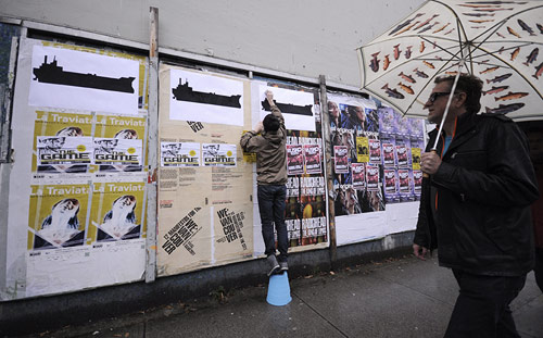
PHOTOGRAPHS OF POSTERS IN THE CITY CENTRE:


All of these images link well with texture - colour - location - form - layout - structure and visual placement.

Once again the use of bight colours and very simple design layout is featured. I think this is a main trend within the kind of places the flyers promote. They are not as commercial as other night flyers such as places like oceania - varsity - revs. They all seem to use week design like bright light effects and splattering to help promote their theme location and identity.

IN ADDITION - MENU'S IN LEEDS - WHAT IS GRAPHIC DESIGN:
There are many forms of menus' in Leeds all for different location. I have also looked into these, they seem to relate to or go hand in hand with promo stuff such as the posters/flyers i have placed above. Here are some designs i have picked up from the internet. All the designs are pretty basic and seem to all relate to common themes :
KEBAB MENUE'S: i hate these types of menu's - I feel they need to be developed and don't represent design just more formative structures.


DESIGNS LIKE THIS:


http://jakesbar.co.uk/ - ONLINE MENU - TURN PAGES
Here are some headers of frozen images from the website:


PHOTOGRAPHS FROM THIS ABOVE WEBSITE - INSIDE JAKES BAR


DRYDOCK LEEDS - http://www.screampubs.co.uk/thedrydockleeds/


Using bright colours and the use of adding real photographs with online illustration techniques such as these above i think creates a good well balanced attraction between student varieties at dry dock. I feel they translate student life as they are quite fun - attractive - colourful - and relate to a lot of people as they look visually pleasing.
IN THE HOME - THINGS THAT TRANSLATE THE QUESTION ' WHAT IS GRAPHIC DESIGN?'


Other things in the home i have found -
- CLEANING PRODUCTS
- BOOK/MAGAZINES
- POSTERS
- DVDS/CDS
- LETTERS
- WARNINGS
- NOTEBOOKS
- FOOD LABELS
- DRINK LABELS
- ETC

THE USE OF CDS/VIYNLS/DVDS AROUND THE HOME:

USE OF LABELS/PACKAGING AROUND THE HOME:

THE TELEVISION TRANSLATES DESIGN AROUND THE HOME:

2D VISUAL/MOTION GRAPHICS/VIDEO RESEARCH ON 3 TOPICS:http://www.booooooom.com/sorted/design/
I have found this website with some interesting promo work on - simple background - simple text - simple image/symbols used in all designs.
RESEARCH: DESIGN RELATING TO STUDENTS:
AFTER A QUESTIONARE I CREATED ON EXTENSION TO THIS PROJECT BRIEF, MY ANSWERS CONFIGURED THAT MOST STUDENTS I TALKED TO LIKED TO USE MOTION AND FLIP GRAPHICS. THE USE OF STOP MOTION ON WEBSITES ETC ATTRACTS THEM. SO HERES A FEW I COLLECTED FROM WWW.FFFFOUND.COM :


WARNING - FLASHING IMAGES BELOW -


I found that the use of bright colour of black and white work well. They attract an audience and are a category of graphic design.
No comments:
Post a Comment