Showing posts with label OUGD502. Show all posts

Friday, 31 May 2013

PPP End of module Evaluation


1. What skills have you developed through this module and how effectively do you think you have applied them?

Throughout this module i have learnt skills to do with the business side of design. I have developed an insight into how business are run and specific sectors they are in. I believe this has taught me a great deal about how much money you should be charging, and the response to the media.  

2. What approaches to/methods of design production have you developed and how have they informed your design development process?


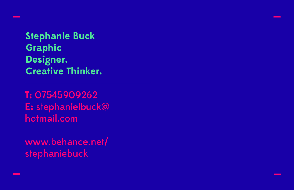
I have used  outside printers to print my buisness card. This taugh me alot baout having to get the specs right for print and making sure the designs are of teh right colour format. dESIGN PRODUCTIOn FOR THE ppp module is effective in pushing mutiple prints. 
I recieved 250 for £16 which i feel is a good deal. 
The rest of my design i used was from the. 

3. What strengths can you identify in your work and how have/will you capitalise on these?

I feel that i have gained some strengths throughout this module that has allowed me to push myself. These include, time management skills - Through doing the task with fred carrying on the process i feel that this is one of my real strengths that i have gained. I also feel i did quite well with my printing slot. This was from my time management processes. With this i had time to change and improve my printing due to me booking my print slots. I feel that i was very organised  for me to achieve.


4. What weaknesses can you identify in your work and how will you address these in the future?

I feel that my blogging could of been developed furthers. I should of developed a more extensive range of ideas and blog posts to help view this. I also wish that that i had explored the brief in a lot more extensive range. The use of designers i have used is ok, but i should of developed this further to get the best out of the module. I should of also pushed my skills in researching. Whenever i found a piece of work i liked i never placed it onto the PPP blog and i feel that if i did it would of backed up lot of information. Insetad a chose to place spefcic things on which i feel now, was the wrong thing to do. I think that i have discovered weakness when printing my final products The stock considereation didnt work well for my final CV, and 

5.Identify five things that you will do differently next time and what do you expect to gain from doing these?

- I will not focus and pay to much attention to detail and lose focus on the designs/ concept as it has cost me alot with this moduel.
-  I will learn to control my writing to be informational and productive
- To use illustrator in my designs
- To research deeper into specific things and to check contents
- Work on spelling
- Keep looking at crits and techniques

Sunday, 26 May 2013

What is a Creative CV Task

What is a Creative CV?

A creative CV is one which demonstrates the strengths of your skills and experiences as a creative. It aims to present you and your work in the best possible light and highlight why you are appropriate for the job/placement. 

Who are you writing it for?


small to medium to large design studios / companies in film / magazine (most likely to ask for a CV) 

with interest in editorial 

Who needs to read it?

The creative director of the studios I will be applying to / studio representatives. 

Who will actually read it?


Could be anyone at a studio I like to someone browsing my website.

What do they need to know?


That I have the skills and experience to design with confidence.

What do they want to know?


I am motivated, hardworking and creative/


Examples of Creative CV :


I have selected these images because i believe that they are good examples of creative CVs. The use of creating something that isn't a poster or a4 sheet is unique. I really like the 'lunch' bag idea as it translates a positive message.


Branding Development

Branding Set:


Saturday, 25 May 2013

Branding Development

Letterhead:


Simple white background developing into purple and green to match the business cards. 


Branding Development


Choosing to keep the same colour scheme works across a wide range of branding methods works well, athough when all together the design can start to look quite garish and bright. I think maybe for next year i can devlop the baranding to be less colourful and more stylistic.


Friday, 24 May 2013

Final Website

My Website:

I chose to keep it simple with my website.

This is because it fits my colour scheme and work.


There are a few pages which need to be developed further, with transfers and i need to highlight methods of cloicking and formats. 

Tuesday, 21 May 2013

Final Business Cards

I chose to use a bright colour to attract clients. A simple format also works well to symbolise my design skills. 


The back of the business card is simple and formal. Name and email and contact details is effective. 

Saturday, 18 May 2013

Final Business Cards

For my buisness car i wanted to devlop a simple asthetic for the design. I chose to use the colour purple and have bright aspects of my design. 

I also wanted to get a kind of tag line:
this is because it could create a useful and catchy thing that could get clients attention.


I started to develop a logo. it was a symbol for stephanie louise buck. I chose to do this in a symbol formation that could be used as an image of logo.

I was thinking of a background colour and chose purple. I like the aesthetic of purple and think the colour works well. it is my favorite colour and i fee it could work on my buisness card.   

Friday, 10 May 2013

Website Development

For the website i chose to stick with my colour scheme. The website i would like is to be boxed off. 


Having images of work displayed in an order like this however, could look cluttered and too much. 


Pop up menus could be useful for my transfers through my images and pages.


simple asthetics could work well to push the design futher.
i WANT TO KEEP MY DESIGN SIMPLE.


The grid format for my designs works to section off sections in a


Branding / Online Presence:


I feel that my website looks simple and esy to use which is what i am aiming for. I have tried to tie the theme in with that on my online presence such as using the same colour scheme. 

If i had more time i would devlop te website and start to create the 'tansfer' pages.