Developmental work:
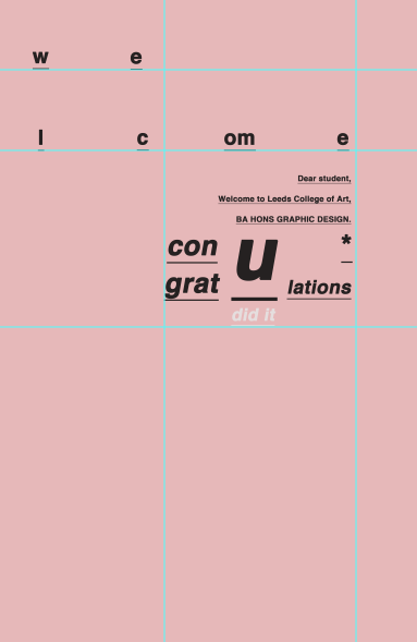
Working on an interesting layout for my letter for students. This will need to catch their attention and allow for information to be received quickly and clearly. i quite like the pink design, maybe it only appeals to one gender? stereotypical but maybe true in this case?
Calander layout - Somple design with shaded backdrop cirlces bending the most important dates.
I wanted to keep the clanger s on of of the the simpler designs based upon the research i had undertaken. I feel that the design work quite well even when there is nothing on the left hand side, but i will need to add to the design.

TOO MUCH TYPE - I attempted to create a welcome letter, ut the type on this design is way to bold and doesn't fit right with the rest of the designs.


Added information to the student calendar.

Simple desigs: I like the background colour of these designs and i feel that it works well to compliment the green tone and the black type.

CALANDERS IN GREY:


ICEBREAKER; Too bold background, the green circle doesn't look right and i feel that it is too much on the background and distracts from the information.

TYPE EXPERIMENTS, the use of the different type layouts creates an interesting layout, but however does look a bit 'to much'.

Variation in Grey:

BOLD HARSH TEXT
these designs are too much and look slightly messy if I'm being honest. I feel that i can work on these to control the design.


I will work on these late developers to see if i can make more changes and press the matter further.
No comments:
Post a Comment